
Tuesday 16 February 2016


Wednesday 10 February 2016

Sunday 7 February 2016
Moodboard and bainstorm of ideas

magazine adverts need to be effective and need to have an impact upon the viewer. i think that these are styles form different genres. this in important because this allows me to see what styles there are and how they can be developed on and changed to match my style and genre. in The Verve, Noah And The Whale and The Maccabees they have used images that have not included images of the band members and they have used the outdoor style to their design. i think that y having designs similar to these it will be the most effective because this will allow me to link my magazine advert style to the genre and features that are in my music video
Mock up of magazine advert

this is a mock up of my music magazine advert i have used a landscape shot because i think that this is effective as there are not many designs like this out there. i think that by using an image that doesn't include the band members this allows the viewer to see what style the band is. by using an image like this one it links to the music video and the lyrics of the song. one of the most frequently used words is 'highway' and 'on the road again' i think that by using images that relate to the song this will allow the viewer to make a connection between the two. the use of this image links to the and but doesn't make the band to obvious until you look at the title and the name of the album. i think that this is effective because this allows the viewer to have to look further into the product whereas they may just skim over it if they had the band members printed on the page.
Friday 5 February 2016
Synergy - Lorde Pure Heroine


Lorde uses darker colours and themes through her music videos and other media forms this is effective this is because it help to portray her style of music. the colour black has been used to show power, mystery, elegance and the unknown. Lorde has chosen this style because she has create a style of music which is mysterious and possibly sinister. I think that across these three platforms she has been able to create a style that is specific to her. the use of no image on the album cover is effective because this is allowing the viewer to interoperate the style into their own ideas. this is effective because it will appeal to people in different ways which allows there to be a wider audience which all interoperate her music in different ways.
On her magazine advert she has used a mainly dark style to her mise en scene this is because of the long hair style, the makeup and the background that she has used. I think that the combination of all of these features allow her to make a style that is personalized to her. she has used the same style in her music video for tennis court because she has only used footage of her singing at certain point of the video. this has been done to allow people to focus on her more and not the dinging that she is doing.
the lighting in the advert and the music video are similar she has used a highlighting effect that is focusing mainly on her face. this has been used in the video to allow the viewer to focus on the facial expressions that she is portraying to the viewers. it has been used most effectively in her music video because she is the only feature throughout and by placing her on a black background this is crating a bolder contrast on her face allowing there to be an emphasis on her facial expressions and features. she is not wearing any eye makeup and she has a bold purple lipstick on this has been done to allow there to be a central focus point on her face. this is effective because the viewer is drawn in to this feature.
Synergy - Rihanna Loud

The theme of pink and red are used throughout all of Rihanna's music videos from the album LOUD this is important because it allows there to be a connection for the viewer between all of the different songs. in the music video she has used the colour pink in all of her shots. this is used to make the music video flow together well. The colour red is used to show power and energy this is done on all platforms this is the most effective because this is presenting Rihanna in a dominating way. in the video a red style of filter has been applied to all of the shots this is good because this makes it so everywhere you look there is the constant theme of pink and red.
The costume in the music video is different form the advert this is because she is wearing a white top and a floral skirt this is showing her in a feminine way however the use of the white in a contrast to the red is effective because this allows the styles not to be identical. the clothing in the music video and on the CD are not very prominent because they are used in a natural contrast compared to the surrounding area that is on video and the use of the colours red and pink throughout all platforms. however in the advert the outfit is a more prominent factor because she is wearing a bold red dress that allows the viewer to focus on this along with the jewellery features that have been used to draw in the attention.
In the magazine advert and the cd cover she is not looking directly at the camera this is the most effective part of the cd this is because it is showing her distanced from the viewer. this is showing her a more mysterious person who is not focusing on the cameras. this is changed in the video because she is shown directing her looks towards the camera she is also focusing her energy more towards the camera. this is effective because this makes the viewer seem more involved and included in the video therefore being more effective to the audience.
Synergy - Taylor Swift Red


Within Taylor Swifts new album RED she has used a main style throughout. the main colour schemes within the video, advert and album are red and white these are both bold colours that contrast each other. Red which is also the name of her album is associated with energy, strength and power this is important because this is representing her in an important way. in a contrast to this the white that is used on the covers and in the outfits that she wears is powerful because this is portraying her as innocent, pure and safety. this is important because this is what is used to show her in contrasting way this is because the colour red is representing danger and energy where as the white is showing safety and calm. this is key because this can bee seen as showing her split personalities.
with her costume in the opening scene of the music video she is wearing the same black hat that she is wearing in the album and on the advert. this is effective because it allows there to be a piece of clothing that she is constantly associated with. she is wearing the same white style of clothing in the music video and generally girly clothing. however at 2.25 seconds her style changes and she is wearing a full black outfit this suggests she is powerful, elegant and the unknown this is used in a great contrast to the whites and reds because this is displaying her in a alternative style which is important because this is what appeals to more viewers.
the locations in the video mainly are based around a beach and house setting this is showing a setting that includes lots of shots of friends and people together. this style is important because this is allowing the viewer to gain a link between the video and them selves. this is important because this allows the audience to feel more involved with the video and the artist themselves.
in the advert and the album you are able to see her face however she is not looking directly at the camera this is suggestive that she is distant from the focus which is the camera. The use of this means that you are able to look more into the expression on her face and this create a universal focus point for all of the viewers. in both shots she is wearing a black hat and a white top this links to the colours and how purity and energy is represented within a photo of one person.
Thursday 4 February 2016
Representations - Lorde Pure Heroine

Lorde uses a very basic style to her albums and magazine adverts I think that the use of a single shot is the most effective because it allows there to be a central focus point on the image. I think that the use of this style of a neutral selection of colours makes the darker features such as her hair and eyes stand out more allowing them to match the title and the bolder text on the screen.
Lorde is represented in a in a sophisticated way the use of the colours beige and cream allow the style that she is presenting to be more mature. the colour cream could also be associated with purity and this is allowing the style to contrast the look that she goers for usually. furthermore the use of the colour grey can be seen as an emotionless and conservative colour this relates to the facial expressions on Lorde because it portrays her in a moody way.
I think that the use of thirds has again been used to allow the page to be divided up into sections because this shows the uniform and well layer out style of the advert. the conventions of a magazine are consistent there us the uses of the album title, artist name, release date and other features such as the record label logo. these are important because these are used to allow the viewer to see what style the artist is through the font and the record label.
Overall Lorde is represented in a moody and conservative way this is effective because this is used to draw the viewer and the audience in because this is used to allow the viewer to create a focus point of their own allowing them to focus on the feature which is Lorde and not any of the peripheral features such as the background.
Conventions - The Killers Day And Age

This magazine advert is promoting the killers. they have used the same artwork on the cover of their magazine allowing them to have a consistent style throughout. it includes many of the main features of a magazine advert it has a title, band name and the album features. this is effective because it allows the viewer to see what the main features of the album are going to be. the use of sections on the advert have been used to divide it up into parts that include the features. It has a bold background photo and it is cut into thirds to allow the product to have a clear cut effect that will appeal to people. it has been done in a uniform way to allow there to be a constant and smooth finish to the product.
they have used the record label for vertigo and this is a record label that usually signs artists from hard rock style this is allowing the viewer to see the style of music that they are producing. I think that the use of this will allow the viewer to see the standard that the music is up to because Vertigo have signed record deals to bands such as Metallica and Razorlight allowing the viewer to see what other kinds of music they sing deals to.
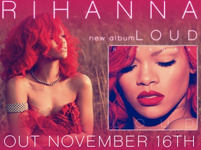
Representations - Rihanna Loud
in this advert Rihanna is shown in a mysterious way she is bot directing any of her looks towards the camera this is important because it shows the viewer that she is distant from the viewer. this advert includes an image of the album, however this is not the central focus of the advert because the landscape shot of Rihanna is used as the centre feature in the shot. the mid shot used on the magazine cover looks like she is sat in a corn field this is used top drawer her closer to nature. the use f facial expressions has been used to portray emotion this has shown her has a more venerable character in the shot.
She is wearing a red dress in the shot and this is used to show sexuality and beauty. the use of this bold colour is effective because it is used around the text in the photo of her and in relation to her hair and makeup this create a link between all of the colours and style that is used in the shot. she is wearing a silver necklace and a silver arm cuff this related to the convention to Pop and R&B because the use of jewellery is used to develop their outfits. the use of all of the se different features allows the viewer to connect and means they are able to find clothing and jewellery similar to this allowing them to feel more linked with the artist and the style that they are trying to portray. this shows the viewer that they are able to receive inspiration from the artist.
Representations - Taylor Swift Red
In Taylor Swifts music style she uses Pop styles along with folk. these are two very different styles allowing her to appeal to a wider audience. in many of her videos and adverts she is shown in a different way compared to many other female artists of her genre. she is presented in a much bolder and powerful kind of way. this is effective because this is creating a much more effective style for her and her music.
I think that the use of the colour red in the new album called Red is effective because not only does it relate to the album and the advert it also is suggestive that it is related to energy strength and determination this is effective because it allows the reviewer to develop an understanding of the style that she is wanting to achieve and the genre of her music. the use of the colour red on a black and white photo is bold because this allows here to have features in the advert. the colour red can also be used to represent love this is linked to her music because of the love song style that she is portraying in her music videos and the lyrics that she uses.
the use of a almost full body shot is effective because this means they are able to show the style of clothing and the outfit that she is wearing. this is effective because this allows the viewer to see what style of clothes that she wears. this is important because this could mean that many of the viewers are able to relate to her and are able to style themselves like her which will help her to become more popular among her fans.
Conventions - The Script Hall Of Fame

In the scripts magazine advert he has used ab basic style that is effective he has included a show of someones hands with a pocket watch in them. the use of this show uis effective because it used to show time and how it is changing. the title of the song is ' the man whio cant be moved' this is in relation to the shot of the advert because it is showing a style of movement in the photo. on the advert it shows the date of release, the band name and the name of the album that is being advertised. this is important because this is abiding by all of the standard conventions of a magazine advert this means that they are effective because it allows all the features to be shown when they need to be and in the best and most effective way possible.
in the bottom right corner there is the logo of the record company allowing the viewer to see the genre and style that this music is associated with. the use of this allows there to be a generalised approach to the style that the music is. there is also a shot of an iTunes label and the price. this could be used to show the price of the EP that is being sold online. this is effective because it allows the viewer to see what other platforms the music is available on.
Conventions - Kasabian

This is a very basic magazine advert the use of bold lettering is effective because this allows there to be a focus point on the magazine that allows the viewer to see the band name and who they are. the band name is the boldest text on the page this is drawing the audiences attention in to who the advert is about. the text front is consistent on the albums and other platforms that this band is shown on because this allows the viewer to see the style and who they are just by looking at the font that they have used. by putting the text across they centre of the page this means that you are instantly drawn to this and the centre of the image.
the use of the release date has been done in a bold front showing this clearly. they have used a few ratings from magazine companies and platforms ton show the popularity of their products and who is listening to them.
the images that are used is a god holding a woman this is suggestive of power and control this is sowing that the music style is bold and eye catching. they have used the king of spades logos at the bottom and tp of the advert to make it look like a playing car this then links to the fact that there is a god like king on the front o f the advert.
the advert has used more than three main colours which is effective because this allows there to be a consistent style on the advert. they have used Black Red Green Blue and White by using basic primary colours this means they are able to create a basic yet effective style to the advert.
even though there are minimal links ton convention in the advert it is still effective and gets the main purpose and style across with they key features which are the dates and the artists name and their style.
Subscribe to:
Posts (Atom)